2016 AIA Austin Homes Tour
Every year some of the best new homes are opened up for the public to appreciate, and every year I try and pick a few favorites to add to my "must see" list. It's a bit of an overwhelming challenge when there are so many good homes to pick from. I haven't been through any of these homes yet, but based on the fantastic photos by Leonard Furmansky below are my top picks for the 2016 AIA Austin Homes Tour in no particular order.
Mell Lawrence
I fully admit to being a huge Mell Lawrence fan boy. Walking through his Hollowcat Wild home a few years ago was practically a religious experience for me. I expect this years home to be every bit as good.
Why I love it: Board formed concrete gets me every time. The weight and massing of it here and the wonderful lightness of the floating roof make me tingly. The illusion is carried inside as well with windows that extend beyond the ceiling line making the whole roof look as if it's floating. The rest of the detailing is wonderfully simple and brings in lots of warm woods to balance the concrete.
Nick Deaver
You may recognize Nick's handy work from this Dwell article. While his walkabout home was a much more rural modern project this one is all about the infill.
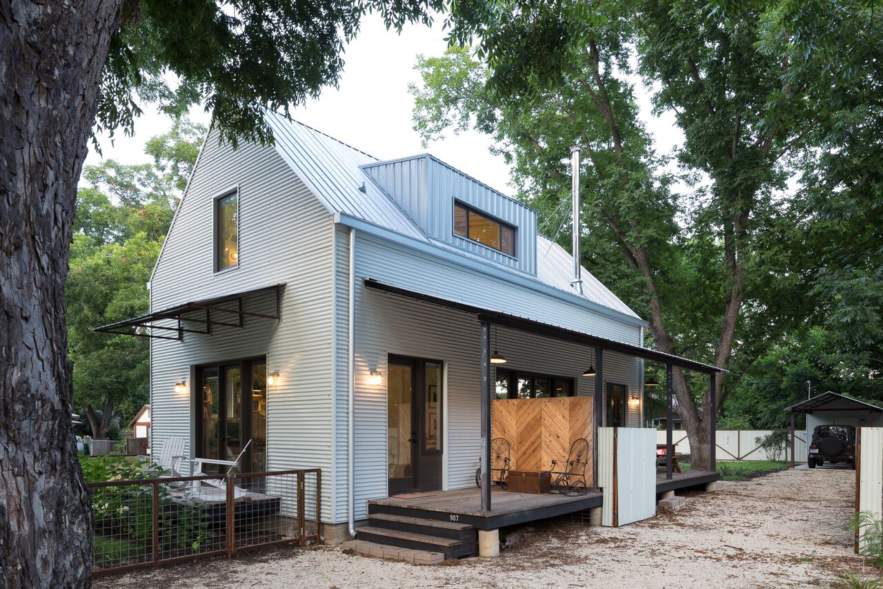
Why I love it: Tearing houses down is easy. Taking on the challenge of keeping old bones and adding on them is much tougher. I love it when architects draw a strong contrast between the structures like Nick did here. Speaking of contrast, the corrugated siding next to the super clean floor to ceiling windows is amazing.
Rauser Design
The name Rauser Design was new to me, but the builder of this home isn't. Matt Risinger and Risinger homes has been setting a high bar for quality construction for some time now.
Why I love it: The whole modern farm house is a well established trend these days but what makes this home special is the way it was built. The "Perfect Wall" approach is pure construction science geekery. It also forces a very different aesthetic with all the exposed framing inside, one that lends it's self perfectly to modern farm house.
Tornbjerg Design
Tom Tornbjerg comes out of the Bercy Chen office, but he didn't hit my radar until he started doing a bunch of spec homes a few years ago. This beautiful house was a custom commission that started out as a major remodel and turned into a ground up redo.
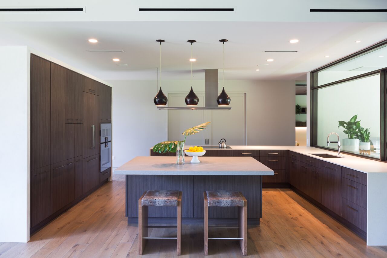
Why I love it: The grey exterior facade of this house gets contrasted by white walls that are pulled in to create a covered porch. The result almost looks to me like a modern nod to mansard roofed homes of southern California. Inside is simple and clean and has some nicely detailed cabinetry, something that always catches my eye.
2016 Tour Dates: October 15-16
Wristbands can be purchased with credit card online here, at the Center for Architecture at 801 W 12th St., and by cash or check at Nannie Inez at 701 S Lamar, Zinger Hardware at 4001 N Lamar, and NEST Modern at 2603 S Congress.


